
iOS Notifications
On his blog, Shawn Hickman proposes the best re-design of the iOS notification system I've seen. I think it's nearly perfect.
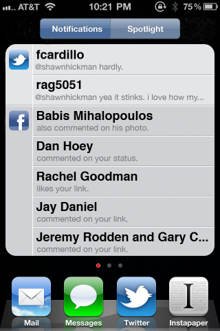 Shawn Hickman's iOS notification screen
I would make only two changes:
1. Move the Spotlight screen from a toggle within the notifications screen to its own screen—off to the left. It's easier to swipe left again than to tap a toggle. Additionally, when there aren't any notifications, perhaps the notification screen doesn't appear at all, so Spotlight is more accessible and you don't have to swipe past a blank screen to get there.
2. Reduce the timeout form 5s to 2s. When a notification comes in, you decide almost instantly if it's something you need to attend to immediately. If it is, you tap it and off you go. If you'd rather ignore it, then waiting 5 seconds seems like an eternity. Tapping the "close" button isn't any better than what you do now.
I like that the notifications bar slides up and over the dock, rather than pushing the screen upwards. When you're inside an app, this can be more disruptive than a modal dialogue, since UI elements can get pushed off screen. This happens currently when using an app while on a call—the content in this case is pushed downward by the OS. Smart choice here by Shawn.
I think most people agree that iOS needs a notifications overhaul, and here's to hoping that iOS 5 brings it to us. I can't see it getting much better than what Shawn has proposed.
 Share | Comments Off